Color Theory for Illustration
Color Theory for Illustration
Color Theory for Illustration
Color theory is a fundamental concept in illustration that helps artists understand how colors work together, how they can be used to evoke emotions, and how they can impact the overall composition of an artwork. In the Postgraduate Certificate in Infographic Illustration, understanding color theory is essential for creating visually appealing and effective infographics.
Key Terms and Vocabulary
1. Color Wheel The color wheel is a circular chart that organizes colors based on their relationship to each other. It consists of primary colors (red, blue, yellow), secondary colors (orange, green, violet), and tertiary colors (red-orange, yellow-green, blue-violet). The color wheel helps artists understand color harmony and how different colors interact with each other.
2. Primary Colors Primary colors are the base colors that cannot be created by mixing other colors together. In traditional color theory, the primary colors are red, blue, and yellow. These colors are used to create all other colors on the color wheel.
3. Secondary Colors Secondary colors are created by mixing two primary colors together. The secondary colors are orange (red + yellow), green (blue + yellow), and violet (blue + red). These colors are located between the primary colors on the color wheel.
4. Tertiary Colors Tertiary colors are created by mixing a primary color with a secondary color. There are six tertiary colors: red-orange, yellow-orange, yellow-green, blue-green, blue-violet, and red-violet. Tertiary colors are located between primary and secondary colors on the color wheel.
5. Color Harmony Color harmony refers to the pleasing arrangement of colors in an artwork. There are several color harmonies, including complementary colors (colors opposite each other on the color wheel), analogous colors (colors next to each other on the color wheel), and triadic colors (colors evenly spaced around the color wheel).
6. Value Value refers to the lightness or darkness of a color. Artists use value to create contrast and depth in their artwork. By adjusting the value of colors, artists can create emphasis and focal points in their illustrations.
7. Saturation Saturation refers to the intensity or purity of a color. Highly saturated colors are vivid and bright, while desaturated colors are more muted and subdued. Artists use saturation to create mood and atmosphere in their illustrations.
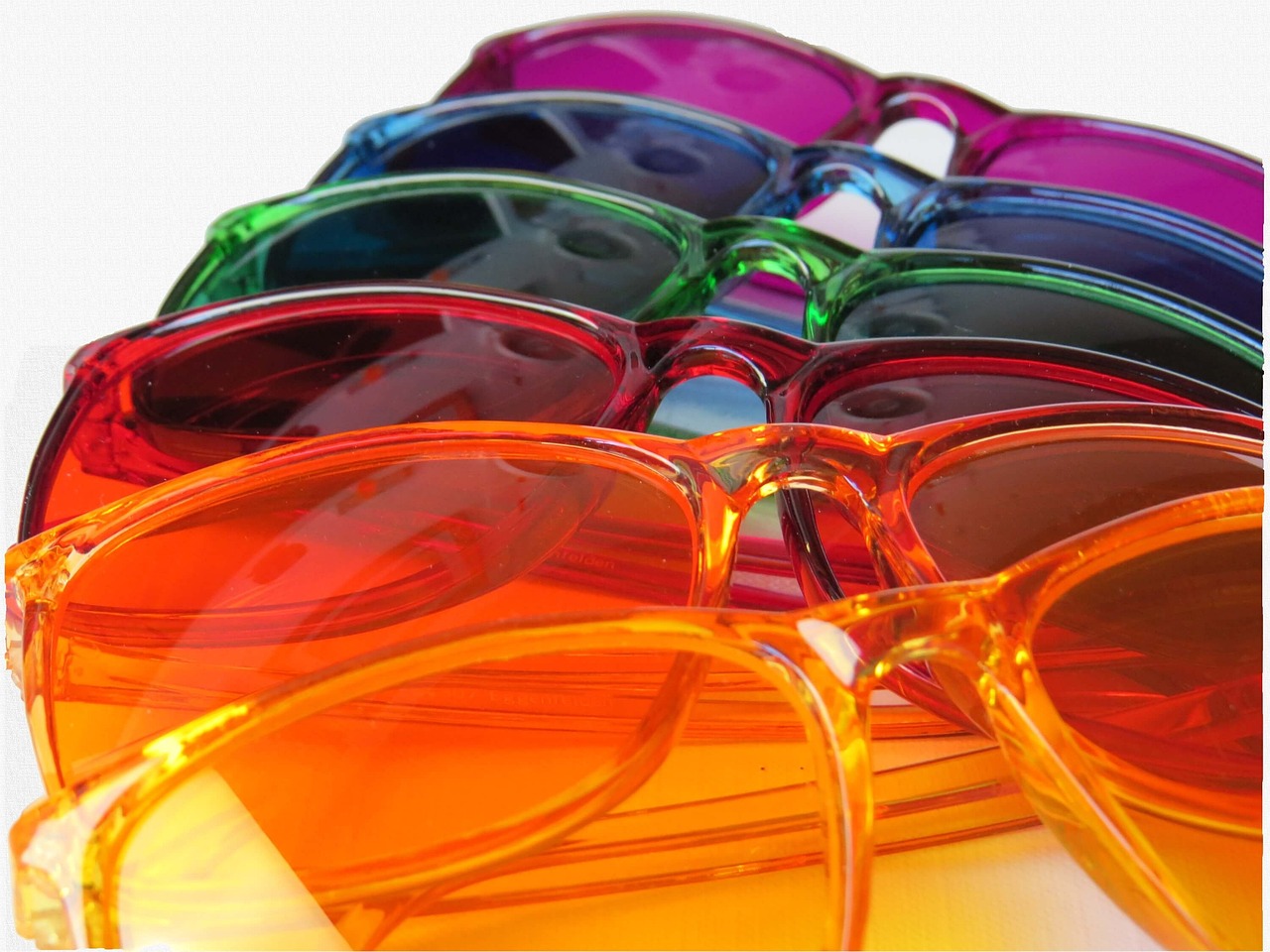
8. Warm Colors Warm colors are colors that are associated with warmth and energy. These colors include red, orange, and yellow. Warm colors are often used to create a sense of excitement or passion in an illustration.
9. Cool Colors Cool colors are colors that are associated with calmness and tranquility. These colors include blue, green, and violet. Cool colors are often used to create a sense of peace or serenity in an illustration.
10. Color Temperature Color temperature refers to the perceived warmth or coolness of a color. Warm colors are considered to be "hot," while cool colors are considered to be "cold." By manipulating color temperature, artists can create different emotional responses in their illustrations.
11. Hue Hue refers to the pure color of an object before it is mixed with white, black, or gray. For example, the hue of a red apple is red. Artists use hue to identify and categorize colors in their illustrations.
12. Color Schemes Color schemes are predefined combinations of colors that work well together. Some common color schemes include monochromatic (shades of a single color), analogous (colors next to each other on the color wheel), and complementary (colors opposite each other on the color wheel). Artists use color schemes to create a cohesive and harmonious color palette in their illustrations.
13. Color Psychology Color psychology is the study of how colors can affect human emotions and behavior. Different colors evoke different emotional responses in viewers. For example, red is often associated with passion and energy, while blue is associated with calmness and trust. Artists use color psychology to communicate specific messages or moods in their illustrations.
14. Color Contrast Color contrast refers to the difference in value, saturation, or hue between colors in an artwork. Contrast is used to create visual interest and draw the viewer's eye to specific areas of the illustration. Artists use contrast to establish hierarchy and emphasis in their compositions.
15. Color Balance Color balance refers to the distribution of colors in an artwork. A well-balanced composition has an equal distribution of colors throughout the illustration. Artists use color balance to create visual stability and harmony in their artwork.
16. Color Mixing Color mixing is the process of combining different colors to create new colors. Artists use color mixing techniques to create a wide range of colors and achieve the desired color palette in their illustrations. By understanding how colors interact with each other, artists can create vibrant and dynamic compositions.
17. Color Temperature Shift Color temperature shift refers to the change in perceived warmth or coolness of a color when it is placed next to other colors. Colors can appear warmer or cooler depending on their surrounding colors. Artists use color temperature shift to create depth and dimension in their illustrations.
18. Color Symbolism Color symbolism refers to the cultural associations and meanings attached to different colors. Colors can have different meanings in different cultures and contexts. For example, in Western cultures, white is often associated with purity and innocence, while in some Asian cultures, white is associated with mourning. Artists use color symbolism to convey specific messages or themes in their illustrations.
19. Color Blindness Color blindness is a condition in which individuals have difficulty distinguishing between certain colors. There are different types of color blindness, including red-green color blindness and blue-yellow color blindness. Artists need to consider color blindness when creating illustrations to ensure that their work is accessible to all viewers.
20. Color Theory in Digital Illustration In digital illustration, artists use color theory principles to create vibrant and engaging artwork. Digital tools such as color pickers and color wheels make it easier for artists to select and manipulate colors in their illustrations. Artists can also use digital software to experiment with different color schemes and create complex color palettes.
21. Challenges of Color Theory One of the challenges of color theory is that color perception can be subjective and vary from person to person. What one person sees as a warm color, another person may perceive as a cool color. Artists need to be aware of this subjectivity and consider how different viewers may interpret the colors in their illustrations.
22. Practical Applications of Color Theory Color theory has practical applications in various fields, including graphic design, advertising, and marketing. Understanding how colors work together can help designers create visually appealing and effective communication materials. In illustration, color theory is essential for creating engaging and impactful artwork that resonates with viewers.
23. Conclusion Color theory is a complex and multifaceted subject that plays a crucial role in illustration. By understanding key terms and vocabulary related to color theory, artists can create compelling and visually stunning illustrations that effectively communicate their ideas and messages. Whether working in traditional or digital media, mastering color theory is essential for creating successful artwork in the Postgraduate Certificate in Infographic Illustration program.
Key takeaways
- Color theory is a fundamental concept in illustration that helps artists understand how colors work together, how they can be used to evoke emotions, and how they can impact the overall composition of an artwork.
- It consists of primary colors (red, blue, yellow), secondary colors (orange, green, violet), and tertiary colors (red-orange, yellow-green, blue-violet).
- Primary Colors Primary colors are the base colors that cannot be created by mixing other colors together.
- The secondary colors are orange (red + yellow), green (blue + yellow), and violet (blue + red).
- There are six tertiary colors: red-orange, yellow-orange, yellow-green, blue-green, blue-violet, and red-violet.
- Color Harmony Color harmony refers to the pleasing arrangement of colors in an artwork.
- By adjusting the value of colors, artists can create emphasis and focal points in their illustrations.