Understanding Color Theory and Style
Color Theory and Style are fundamental concepts in the field of Event Decor and Design. In this explanation, we will explore key terms and vocabulary that are essential for understanding these concepts.
Color Theory and Style are fundamental concepts in the field of Event Decor and Design. In this explanation, we will explore key terms and vocabulary that are essential for understanding these concepts.
Color Theory:
Color theory is a set of principles that explain how colors interact with each other and how they can be combined to create different effects. The color wheel is a fundamental tool in color theory, which consists of three primary colors (red, blue, and yellow), three secondary colors (green, orange, and purple), and six tertiary colors (yellow-green, blue-green, blue-purple, red-purple, red-orange, and yellow-orange).
Primary Colors:
Primary colors are the three colors that cannot be created by mixing any other colors. These are red, blue, and yellow.
Secondary Colors:
Secondary colors are created by mixing two primary colors. These are green (created by mixing blue and yellow), orange (created by mixing red and yellow), and purple (created by mixing blue and red).
Tertiary Colors:
Tertiary colors are created by mixing a primary color with a secondary color. These are yellow-green, blue-green, blue-purple, red-purple, red-orange, and yellow-orange.
Hue:
Hue refers to the property of a color that distinguishes it as red, blue, green, etc. It is the purest form of a color and is located on the outer edge of the color wheel.
Saturation:
Saturation refers to the purity of a color. A fully saturated color has no white, black, or gray added to it, while a desaturated color has white, black, or gray added to it, reducing its purity.
Value:
Value refers to the lightness or darkness of a color. A color with a high value has a lot of white added to it, while a color with a low value has a lot of black added to it.
Color Schemes:
Color schemes are combinations of colors that are used together in design. There are several types of color schemes, including:
Monochromatic: A monochromatic color scheme uses different shades, tints, and tones of a single color.
Analogous: An analogous color scheme uses colors that are next to each other on the color wheel.
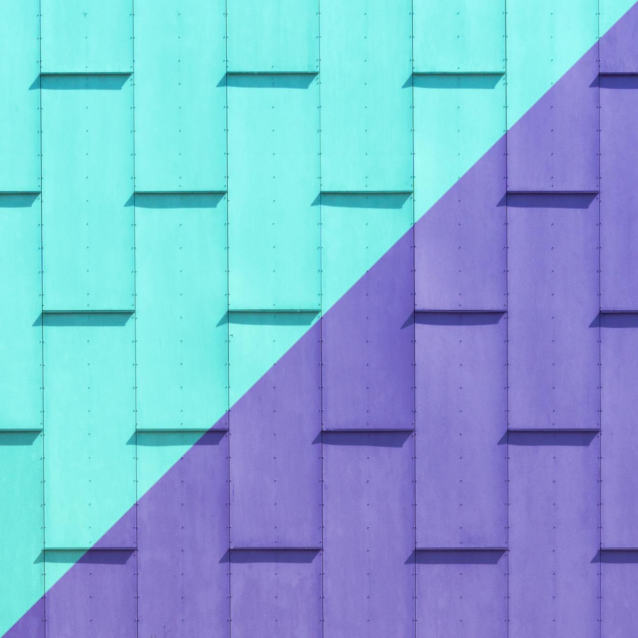
Complementary: A complementary color scheme uses colors that are opposite each other on the color wheel.
Split-Complementary: A split-complementary color scheme uses a color and the two colors adjacent to its complement.
Triadic: A triadic color scheme uses three colors that are evenly spaced on the color wheel.
Tetradic: A tetradic color scheme uses four colors that form a rectangle on the color wheel.
Style:
Style refers to the visual language used in design. It includes the use of color, typography, imagery, and other elements to create a cohesive look and feel. Here are some key terms related to style:
Mood:
Mood refers to the emotional tone of a design. It can be created through the use of color, typography, and imagery.
Tone:
Tone refers to the attitude or feeling conveyed by a design. It can be serious, playful, sophisticated, or casual.
Texture:
Texture refers to the visual or tactile quality of a surface. It can be smooth, rough, glossy, matte, or anything in between.
Form:
Form refers to the three-dimensional shape of an object. It can be geometric, organic, or abstract.
Balance:
Balance refers to the distribution of visual weight in a design. It can be symmetrical, asymmetrical, or radial.
Contrast:
Contrast refers to the difference between two elements in a design. It can be created through the use of color, size, shape, or texture.
Proportion:
Proportion refers to the relative size of different elements in a design. It can be harmonious, balanced, or dynamic.
Hierarchy:
Hierarchy refers to the order of importance of different elements in a design. It can be created through the use of size, color, or placement.
Grid:
A grid is a framework used to organize elements in a design. It can be used to create consistency and balance in a design.
Alignment:
Alignment refers to the way elements are lined up in a design. It can be used to create order and structure.
Challenge:
Choose a color scheme and create a mood board that showcases your style. Consider the following questions as you work:
* What mood do you want to convey? * What tone do you want to use? * What texture will you use to add visual interest? * What forms will you use to create visual weight? * How will you balance the elements in your design? * How will you create contrast and hierarchy? * How will you use alignment and grids to create order?
Example:
A monochromatic color scheme using different shades of blue could be used to create a calming and serene mood. Adding texture through the use of watercolor brushstrokes could create visual interest. Using geometric forms and balancing the elements through alignment and grids could create order and structure. Contrast could be created through the use of different sizes and weights of typography, while hierarchy could be established through the placement of key elements.
Conclusion:
Understanding color theory and style is essential for creating successful event decor and design. By using the key terms and vocabulary outlined in this explanation, you can create cohesive and effective designs that convey the desired mood and tone. Through the use of color schemes, texture, form, balance, contrast, proportion, hierarchy, alignment, and grids, you can create visually stunning and impactful designs that leave a lasting impression.
Key takeaways
- In this explanation, we will explore key terms and vocabulary that are essential for understanding these concepts.
- Color theory is a set of principles that explain how colors interact with each other and how they can be combined to create different effects.
- Primary colors are the three colors that cannot be created by mixing any other colors.
- These are green (created by mixing blue and yellow), orange (created by mixing red and yellow), and purple (created by mixing blue and red).
- These are yellow-green, blue-green, blue-purple, red-purple, red-orange, and yellow-orange.
- Hue refers to the property of a color that distinguishes it as red, blue, green, etc.
- A fully saturated color has no white, black, or gray added to it, while a desaturated color has white, black, or gray added to it, reducing its purity.