Color Theory in Food Styling
Color Theory in Food Styling
Color Theory in Food Styling
Color theory plays a crucial role in food styling as it can greatly impact the visual appeal of dishes. Understanding how colors work together and how they can be used to enhance the presentation of food is essential for creating visually appealing photographs and videos for social media, cookbooks, magazines, and advertisements. In this guide, we will explore key terms and vocabulary related to color theory in food styling.
1. Hue Hue refers to the purest form of a color, such as red, blue, or yellow. In food styling, the hue of ingredients can be emphasized or altered to create a desired visual effect. For example, using vibrant red tomatoes in a salad can create a striking contrast against green lettuce.
2. Saturation Saturation refers to the intensity or purity of a color. Highly saturated colors appear vivid and bold, while desaturated colors appear muted or washed out. When styling food, it is important to consider the saturation of ingredients to create a balanced and harmonious composition.
3. Value Value refers to the lightness or darkness of a color. In food styling, the value of ingredients can be adjusted to create depth and dimension in a dish. For example, incorporating a variety of light and dark ingredients in a salad can add visual interest and complexity.
4. Color Wheel The color wheel is a visual representation of the relationships between colors. It is divided into primary colors (red, blue, yellow), secondary colors (green, orange, purple), and tertiary colors (red-orange, yellow-green, blue-violet). Understanding the color wheel can help food stylists create harmonious color palettes and combinations.
5. Complementary Colors Complementary colors are opposite each other on the color wheel, such as red and green, blue and orange, or yellow and purple. When used together, complementary colors create a dynamic contrast that can make dishes visually appealing. For example, pairing a yellow lemon tart with a purple blueberry compote can create a vibrant and eye-catching dessert.
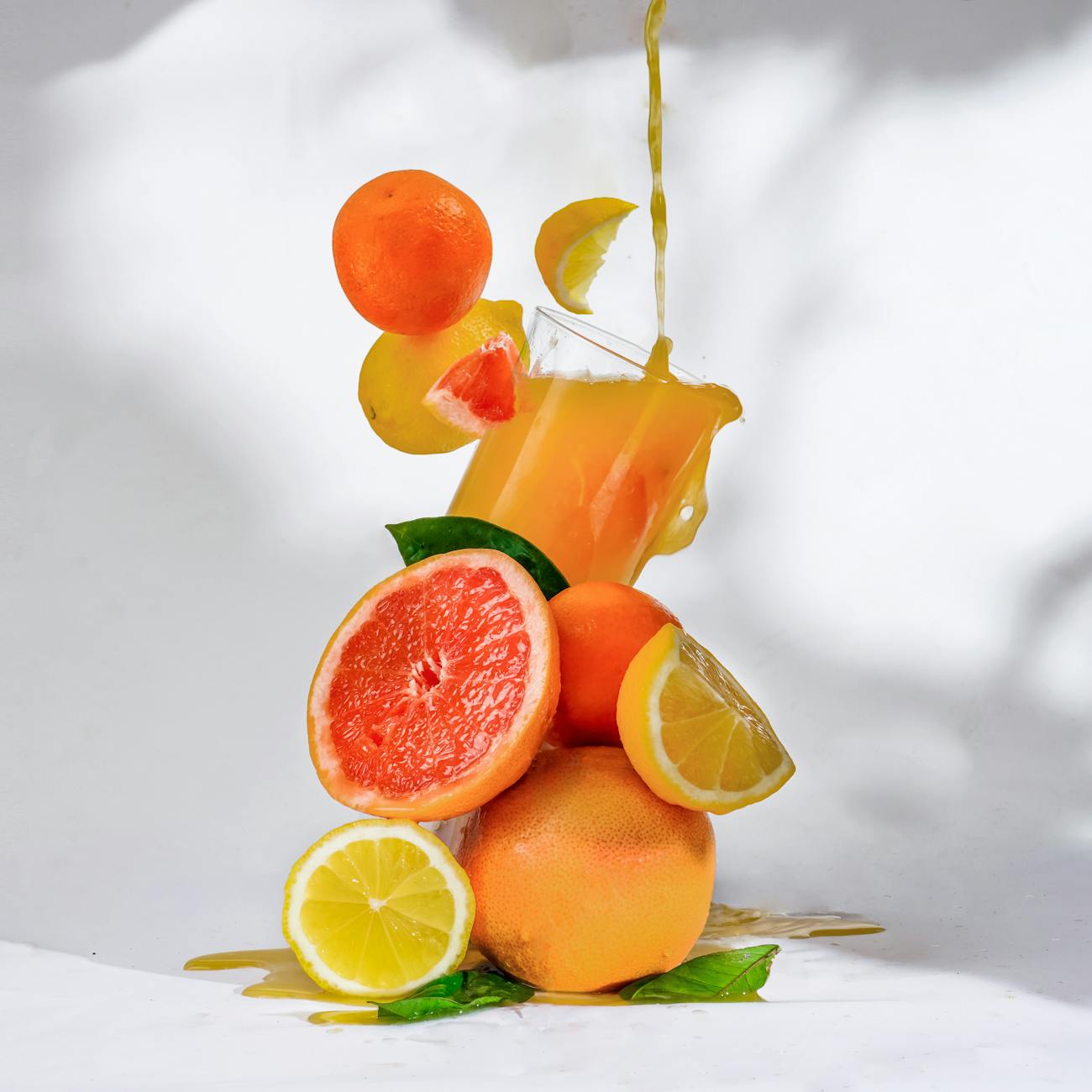
6. Analogous Colors Analogous colors are adjacent to each other on the color wheel, such as red, orange, and yellow or blue, green, and yellow. These colors create a harmonious and cohesive look when used together in food styling. Incorporating analogous colors in a dish can create a sense of unity and balance.
7. Monochromatic Colors Monochromatic colors are different shades and tints of the same hue. This color scheme is simple yet elegant and can be used to create a sophisticated look in food styling. For example, a monochromatic salad featuring different shades of green vegetables can be visually appealing and stylish.
8. Triadic Colors Triadic colors are evenly spaced around the color wheel, forming a triangle. This color scheme creates a vibrant and balanced look when used in food styling. For example, incorporating red, yellow, and blue ingredients in a dish can create a visually striking and dynamic composition.
9. Warm Colors Warm colors, such as red, orange, and yellow, are associated with energy, warmth, and excitement. These colors can stimulate the appetite and create a sense of coziness in food styling. Using warm colors in dishes can evoke feelings of comfort and happiness in viewers.
10. Cool Colors Cool colors, such as blue, green, and purple, are associated with calmness, freshness, and serenity. These colors can create a sense of relaxation and sophistication in food styling. Incorporating cool colors in dishes can evoke a feeling of freshness and cleanliness.
11. Texture Texture refers to the surface quality of an ingredient or dish. In food styling, texture can be enhanced or minimized to create visual interest and appeal. For example, highlighting the crisp texture of a fried food item or the smooth texture of a creamy dessert can add depth and dimension to a photograph.
12. Contrast Contrast refers to the difference between elements in a composition, such as color, texture, size, or shape. In food styling, contrast can be used to create visual impact and draw attention to certain aspects of a dish. For example, pairing crunchy nuts with soft cheese in a salad can create a textural contrast that enhances the overall presentation.
13. Balance Balance refers to the distribution of visual weight in a composition. In food styling, balance is essential for creating a harmonious and visually pleasing dish. Achieving balance involves considering the placement of ingredients, colors, textures, and shapes to create a cohesive and well-rounded composition.
14. Emphasis Emphasis refers to the focal point or main element of a composition that draws the viewer's attention. In food styling, emphasis can be achieved through the use of color, texture, shape, or placement of ingredients. Creating a strong focal point in a dish can make it visually compelling and engaging.
15. Unity Unity refers to the cohesive and harmonious relationship between elements in a composition. In food styling, unity is important for creating a sense of completeness and coherence in a dish. Achieving unity involves ensuring that all elements work together harmoniously to create a visually appealing and cohesive presentation.
16. Practical Applications of Color Theory in Food Styling Understanding color theory in food styling can greatly enhance the visual appeal of dishes and make them more enticing to viewers. By applying the principles of color theory, food stylists can create visually stunning photographs and videos that capture the essence of a dish and evoke a desired emotional response from viewers. Some practical applications of color theory in food styling include:
- Selecting ingredients with complementary colors to create dynamic contrasts and visual interest. - Using monochromatic color schemes to create a sophisticated and elegant look in dishes. - Incorporating warm colors to stimulate the appetite and create a sense of warmth and comfort. - Experimenting with texture to add depth and dimension to photographs and highlight the unique qualities of ingredients. - Balancing elements in a composition to create a visually pleasing and well-rounded dish. - Emphasizing focal points to draw the viewer's attention and create a strong visual impact. - Creating unity and coherence in a dish by ensuring that all elements work together harmoniously to create a cohesive presentation.
17. Challenges in Applying Color Theory in Food Styling While color theory can be a powerful tool in food styling, there are also challenges that food stylists may face when applying these principles. Some common challenges include:
- Limited availability of ingredients in certain colors, which can make it difficult to create specific color palettes or combinations. - Balancing multiple colors, textures, and shapes in a composition to create a cohesive and visually appealing dish. - Ensuring that colors appear accurate and true to life in photographs, as lighting conditions and editing techniques can affect the way colors are perceived. - Adapting to different cultural preferences and associations with colors, as certain colors may have different meanings or connotations in different cultures. - Maintaining consistency in color choices and styling techniques across different dishes or projects to create a cohesive and recognizable style.
By understanding these challenges and developing strategies to overcome them, food stylists can effectively apply color theory principles to create visually stunning and impactful dishes that resonate with viewers.
In conclusion, color theory is a fundamental aspect of food styling that can greatly enhance the visual appeal of dishes and make them more enticing to viewers. By understanding key terms and vocabulary related to color theory, food stylists can create harmonious color palettes, dynamic contrasts, and visually compelling compositions that capture the essence of a dish and evoke a desired emotional response from viewers. By applying the principles of color theory in food styling, food stylists can create stunning photographs and videos that showcase the beauty and artistry of food in a captivating and engaging way.
Key takeaways
- Understanding how colors work together and how they can be used to enhance the presentation of food is essential for creating visually appealing photographs and videos for social media, cookbooks, magazines, and advertisements.
- For example, using vibrant red tomatoes in a salad can create a striking contrast against green lettuce.
- When styling food, it is important to consider the saturation of ingredients to create a balanced and harmonious composition.
- For example, incorporating a variety of light and dark ingredients in a salad can add visual interest and complexity.
- It is divided into primary colors (red, blue, yellow), secondary colors (green, orange, purple), and tertiary colors (red-orange, yellow-green, blue-violet).
- Complementary Colors Complementary colors are opposite each other on the color wheel, such as red and green, blue and orange, or yellow and purple.
- Analogous Colors Analogous colors are adjacent to each other on the color wheel, such as red, orange, and yellow or blue, green, and yellow.