
Maritime Data Visualization and Communication
Automatic Identification System (AIS) is the foundational data source for most maritime visualisations. It provides real‑time information on vessel identity, position, speed, heading and cargo type. When visualising AIS data, analysts often…
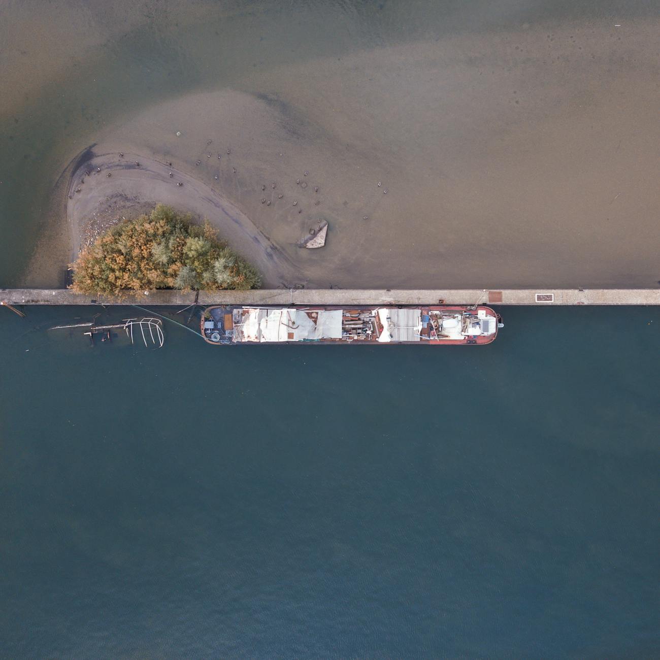
Automatic Identification System (AIS) is the foundational data source for most maritime visualisations. It provides real‑time information on vessel identity, position, speed, heading and cargo type. When visualising AIS data, analysts often plot each report as a point on a map, colour‑coding the points by vessel class or speed. For example, a heat map of AIS positions around a busy strait can reveal peak traffic periods and potential bottlenecks. A common challenge is dealing with the massive volume of AIS messages—hundreds of thousands per day for a major port—requiring efficient data ingestion pipelines and aggregation techniques to keep visualisations responsive.
National Marine Electronics Association (NMEA) sentences are the textual format used by many onboard sensors, including AIS transponders, radar, and depth sounders. Understanding NMEA is essential when integrating sensor data into a visual analytics platform. Each sentence begins with a ‘$’ and includes a checksum for error detection. Converting NMEA streams into structured tables allows analysts to join positional data with environmental measurements such as water temperature or wind speed, enriching the visual context.
Electronic Navigational Chart (ENC) formats such as S‑57 and the newer S‑100 standard define the official maritime chart data used for navigation. ENCs contain vector features like coastlines, depth contours, navigational aids, and restricted areas. When creating a maritime dashboard, loading ENC layers provides the geographic reference that aligns AIS points to the correct sea lanes. A practical issue is that S‑57 files can be large and may contain outdated features; regular updates and careful validation are required to avoid mis‑representations.
Geographic Information System (GIS) software is the engine that processes, analyses, and renders spatial data. GIS enables operations such as spatial joins, buffering, and reprojection, which are indispensable for maritime visualisation. For instance, a buffer of 0.5 nautical miles around a shipping lane can be used to highlight vessels that are encroaching on safety zones. GIS also supports the creation of raster layers like bathymetric depth maps, which can be overlaid with vessel tracks to assess navigational risk in shallow waters.
Projection and datum selection are often overlooked but critical steps. Most global maritime datasets use the World Geodetic System 1984 (WGS84) datum with a geographic coordinate system (latitude/longitude). However, for detailed port‑level visualisations, a projected coordinate system such as Mercator or a locally defined Transverse Mercator may be preferred to minimise distortion. Incorrect projection handling can lead to mis‑aligned features, causing vessels to appear on land or in the wrong channel.
Vector data structures store discrete features—points, lines, and polygons—while raster data represents continuous phenomena such as sea surface temperature. In maritime visualisation, AIS positions are naturally modelled as points (vector), whereas a satellite‑derived sea‑state map is a raster. Combining the two requires careful consideration of resolution: a high‑resolution raster (e.g., 500 m) can be overlaid with AIS points, but rendering thousands of points on top of a dense raster can degrade performance. Techniques such as point clustering or level‑of‑detail (LOD) rendering help maintain interactivity.
Shapefile and GeoJSON are widely used vector formats. Shapefiles consist of several companion files (.shp, .shx, .dbf) and are favoured in desktop GIS, while GeoJSON is lightweight and ideal for web‑based visualisations. When building a web portal that displays real‑time vessel tracks, developers often serve GeoJSON via a RESTful API endpoint, allowing the client‑side map library to render the data instantly. A challenge here is ensuring the JSON payload is compact; using techniques such as geometry simplification or coordinate quantisation reduces bandwidth consumption.
Digital Elevation Model (DEM) and Digital Terrain Model (DTM) concepts extend to the marine environment as Digital Bathymetry Model (DBM). Bathymetric DBMs provide depth values on a regular grid and are essential for visualising under‑keel clearance or for route planning in constrained waterways. By applying a colour ramp to the depth raster, analysts can create intuitive depth‑gradient maps that instantly convey safe versus hazardous zones. Interpolating sparse depth soundings to a full DBM can introduce uncertainties; visualising confidence intervals alongside the depth layer helps users understand the reliability of the data.
Vessel trajectory analysis involves constructing lines from sequential AIS points. These trajectories can be visualised as polylines with varying thickness to indicate speed or fuel consumption. A practical application is the identification of “slow‑steaming” patterns, where vessels reduce speed to comply with emission control areas. Visualising such patterns on a map can highlight areas where policy interventions may be most effective. However, trajectory reconstruction must address data gaps—periods when AIS signals are lost—by applying interpolation or map‑matching techniques.
Port call data records the arrival and departure times of vessels at a berth. When visualised as a Gantt‑style timeline adjacent to a map of the port, stakeholders can quickly assess berth occupancy, turnaround time, and potential delays. Integrating port‑call information with AIS‑derived dwell times provides a cross‑validation mechanism; discrepancies may indicate unreported anchorage or data quality issues. Visual dashboards often employ colour coding to differentiate vessel types (e.g., container, tanker, bulk) and to flag vessels that exceed scheduled turnaround windows.
Fuel consumption and emissions metrics are increasingly visualised for compliance with IMO regulations. By coupling AIS speed data with vessel‑specific fuel curves, analysts can estimate hourly fuel burn and CO₂ emissions. Visualising these estimates on a map using a graduated colour scheme enables quick identification of high‑emission corridors. A common challenge is the lack of publicly available vessel‑specific fuel curves; analysts may need to rely on generic profiles, which reduces accuracy. Transparency about assumptions, displayed as tooltips or side panels, helps maintain credibility.
Maritime domain awareness (MDA) is a broad concept encompassing the situational awareness of all maritime activities within a region. Visualisation tools for MDA typically integrate multiple data streams—AIS, radar, satellite imagery, and security alerts—into a single operational picture. For example, a real‑time dashboard may display AIS points, colour‑coded by risk level, overlaid on a satellite‑derived sea‑state map, with alert icons indicating piracy hotspots. The main challenge in MDA visualisation is data fusion: aligning heterogeneous data sources with differing update frequencies and spatial accuracies while preserving a coherent visual hierarchy.
Decision support system (DSS) dashboards provide actionable insights derived from maritime data. A DSS might combine traffic density heat maps, predicted arrival times, and berth utilisation metrics to recommend optimal berth assignments. The visual layout is crucial: high‑priority information (e.g., imminent arrivals) should be placed in the primary view, while secondary data (historical trends) can be accessed through tabs or collapsible panels. Cognitive overload is a risk; applying gestalt principles such as proximity and similarity helps users parse complex information quickly.
Interactive map elements such as tooltips, pop‑ups, and drill‑down actions enrich the user experience. When a user clicks on a vessel icon, a tooltip can display the vessel’s IMO number, current speed, cargo type, and estimated time of arrival. Drill‑down functionality might then open a separate panel showing the vessel’s full voyage history, fuel consumption curve, and compliance status. Implementing these features requires careful performance optimisation, especially when handling thousands of concurrent users; techniques like lazy loading and client‑side caching are essential.
Clustering algorithms aggregate nearby points into a single symbol when zoomed out, reducing visual clutter. For AIS data, a cluster might show the number of vessels within a 1‑nm radius, with the cluster size reflecting traffic density. As the user zooms in, clusters dissolve into individual vessel icons, preserving detail. A practical challenge is selecting an appropriate clustering distance that balances readability with accuracy; dynamic clustering based on zoom level often provides the best user experience.
Real‑time streaming architectures underpin many maritime visualisation platforms. Data from AIS receivers, radar feeds, and satellite services are ingested via message brokers such as Kafka, then processed by stream‑processing engines that perform filtering, enrichment, and aggregation before pushing updates to the front‑end via WebSockets. Latency must be kept low (ideally under a few seconds) to ensure that the visual display reflects the current state of the maritime environment. Network bandwidth constraints, especially in remote offshore installations, can cause data loss; employing edge‑computing nodes that pre‑aggregate data before transmission mitigates this risk.
Data security and privacy considerations are paramount. AIS data is publicly broadcast, but when combined with proprietary operational data (e.g., cargo manifests or crew schedules), the result can become sensitive. Compliance with regulations such as GDPR requires anonymising personal data and implementing access controls. Visualisation platforms should enforce role‑based permissions, ensuring that only authorised users can view detailed vessel performance metrics while the public view remains limited to aggregate traffic patterns.
Open data initiatives provide valuable maritime datasets without licensing fees. Sources such as the European Marine Observation and Data Network (EMODnet) or the US National Oceanic and Atmospheric Administration (NOAA) publish bathymetry, tide, and weather data that can be incorporated into visual analytics. Conversely, proprietary data—such as commercial satellite SAR imagery—often offers higher resolution or more frequent updates but comes with cost and licensing restrictions. When blending open and proprietary layers, clear attribution and licence compliance are necessary to avoid legal complications.
Web Map Service (WMS) and Web Feature Service (WFS) are standard protocols for serving geospatial data over the web. WMS provides map images (tiles) that can be overlaid on a client map, while WFS delivers vector features that the client can style or query. For maritime visualisation, a WMS layer might supply a base chart of coastlines, whereas a WFS layer supplies dynamic vessel positions that users can filter by attribute. Understanding the capabilities and limitations of each service helps architects design efficient data delivery pipelines.
Geoprocessing tools such as spatial join, buffer, and proximity analysis support advanced maritime analytics. A spatial join between AIS points and a polygon layer of exclusive economic zones (EEZs) can attribute each position to a jurisdiction, enabling compliance reporting. Buffer analysis around oil platforms can define safety exclusion zones; vessels that intersect these buffers trigger alerts visualised as flashing icons. Proximity analysis can calculate the nearest port to a given vessel, a useful feature for logistics planning dashboards.
Risk assessment visualisations often combine probability maps with impact layers. For collision avoidance, a heat map of historical near‑miss incidents can be overlaid with current traffic density to highlight high‑risk zones. Decision makers can then allocate resources, such as additional patrol vessels, to mitigate identified risks. A key difficulty is the scarcity of high‑quality incident data; integrating multiple data sources (e.g., AIS, radar, incident reports) improves robustness but requires sophisticated data fusion techniques.
Route optimisation tools generate recommended paths that minimise fuel consumption, travel time, or emissions. Visualising these routes alongside real‑time traffic density maps allows operators to evaluate trade‑offs. For example, a route that avoids congested straits may be longer in distance but shorter in total travel time due to reduced waiting. Visualisation of alternative routes, each annotated with predicted fuel use and ETA, supports informed decision‑making. The challenge lies in presenting complex optimisation results in an intuitive format without overwhelming the user.
Predictive analytics and machine learning models are increasingly used to forecast vessel behaviour. A model trained on historical AIS data can predict a vessel’s likely arrival time at a port, accounting for speed variations and weather conditions. Visualising the forecast as a moving time‑slider on the map, with confidence intervals shaded around the predicted path, helps planners anticipate delays. Model explainability is crucial; providing interactive explanations (e.g., feature importance charts) alongside the forecast builds trust among maritime stakeholders.
Anomaly detection algorithms identify outlier vessel behaviours, such as sudden speed drops, route deviations, or unexpected loitering near sensitive installations. Visual alerts can be displayed as coloured icons (e.g., red for high‑severity anomalies) that, when clicked, reveal the underlying data and the algorithmic reasoning. False positives are a common challenge; calibrating detection thresholds and incorporating domain knowledge (e.g., expected slow‑steaming in emission control zones) reduces noise and enhances usability.
Data fusion and sensor fusion refer to the process of combining multiple data streams to produce a richer, more accurate picture. An AIS‑SAR integration, for example, overlays satellite Synthetic Aperture Radar (SAR) detections with AIS broadcasts, revealing vessels that may have turned off their transponders. Visualising SAR footprints as semi‑transparent polygons and AIS points as icons enables analysts to spot mismatches quickly. The difficulty lies in aligning datasets with different spatial resolutions, temporal cadences, and coordinate reference systems.
Satellite imagery—including optical, SAR, and L‑band data—offers broad coverage for maritime monitoring. Visualisation platforms often provide a layer switcher that allows users to toggle between base maps (e.g., OpenStreetMap) and satellite backdrops. When examining illegal fishing activity, SAR images can reveal vessel shadows at night, while AIS data may show no transmissions, indicating a likely violation. Integrating these layers requires careful handling of image projection and registration to avoid visual misalignment.
Bathymetry and sea‑state visualisations are essential for safe navigation in shallow waters. By applying a colour ramp to a depth raster, analysts can produce a “blue‑to‑red” depth map that instantly communicates safe channels. Overlaying real‑time wave height data as contour lines adds another safety dimension. Mariners rely on such visual products to plan routes that avoid grounding risks. Maintaining up‑to‑date bathymetric data is a logistical challenge, especially in regions with rapid sediment movement; automated pipelines that ingest new hydrographic surveys help keep visualisations current.
Port performance metrics such as turnaround time, berth utilisation, and cargo flow are frequently visualised in dashboards used by port authorities. Turnaround time can be presented as a bar chart, while berth utilisation is often shown as a stacked area chart indicating occupied versus free slots over time. Mapping cargo flow with flow arrows that vary in thickness according to volume provides an intuitive sense of movement patterns. A practical hurdle is data integration: berth schedules, vessel arrival logs, and container handling records often reside in separate legacy systems, requiring ETL processes to harmonise them for visual analysis.
Digital twin concepts are emerging in maritime contexts, where a virtual replica of a port or vessel fleet is synchronised with live data streams. Visualising a digital twin involves 3‑D models of berths, cranes, and ships, updated in real time to reflect actual positions and statuses. Users can simulate “what‑if” scenarios—such as a sudden surge in arrivals—to assess capacity constraints. The computational load of rendering detailed 3‑D twins for many vessels is substantial; leveraging cloud‑based rendering services and progressive loading strategies mitigates performance bottlenecks.
Scenario analysis visualisations enable stakeholders to explore the impact of policy changes, infrastructure upgrades, or environmental events. For instance, a scenario that models the effect of a new deep‑water channel can be visualised by overlaying projected traffic flows on current maps, showing reduced congestion in existing channels. Interactive sliders allow users to adjust parameters such as vessel size distribution or fuel price, instantly updating the visual outputs. Ensuring that scenario assumptions are transparent—through side‑panel documentation or embedded notes—helps avoid misinterpretation.
Stakeholder communication often relies on static reports and infographics derived from dynamic visualisations. Exporting a map view as a high‑resolution PNG or PDF, accompanied by a concise narrative, facilitates distribution to non‑technical audiences. However, static images lose interactivity; embedding interactive web links within PDF reports, or providing QR codes that launch live dashboards, bridges this gap. Accessibility considerations, such as colour‑blind‑friendly palettes and font legibility, must be addressed to ensure that all stakeholders can interpret the visual information correctly.
Infographic design principles—such as visual hierarchy, balance, and the use of white space—apply to maritime data communication. A well‑designed infographic might combine a simplified map of a shipping lane, a timeline of key incidents, and a set of icons representing regulatory milestones. Gestalt principles like similarity and continuity guide the placement of elements so that viewers naturally follow the intended storyline. Over‑crowding an infographic with too many data points dilutes its impact; selecting the most salient metrics and presenting them with clear legends preserves clarity.
Colour theory is central to effective maritime visualisation. Using a sequential colour scheme for depth (e.g., light blue for deep water, dark blue for shallow) aligns with intuitive expectations. Diverging colour scales are appropriate for highlighting deviations from a norm, such as speed anomalies where red indicates excessive speed and green indicates unusually slow movement. For audiences with colour‑vision deficiencies, palettes such as ColorBrewer’s “colorblind‑safe” options ensure that information remains discernible. Consistency in colour usage across multiple dashboards reinforces user familiarity.
Symbology and legend design must be concise yet descriptive. Vessel icons can be shaped to indicate vessel type (e.g., rectangle for container ships, triangle for tankers) and sized proportionally to gross tonnage. A legend that groups icons by category and includes a brief description reduces the learning curve for new users. However, overly detailed legends can become cumbersome; employing tooltips that reveal full definitions on hover keeps the visual space uncluttered while still providing depth of information.
Annotation features—such as labels, callouts, and on‑map notes—help contextualise data. When a congestion hotspot is identified, an annotation might include a brief description of the underlying cause (e.g., “construction at Pier 3”). Interactive annotations that expand on click enable users to explore additional layers of detail without overwhelming the initial view. A challenge is ensuring that annotations do not obscure critical map features; dynamic placement algorithms that avoid overlap improve readability.
Scalability is a recurring concern when deploying maritime visualisation platforms. As data volumes grow—through higher AIS transmission rates, increased satellite coverage, or expanded sensor networks—backend services must scale horizontally. Containerisation technologies such as Docker, orchestrated by Kubernetes, allow micro‑services handling data ingestion, processing, and rendering to be replicated as needed. Monitoring tools that track CPU, memory, and network utilisation help maintain performance thresholds, preventing latency spikes that would degrade the user experience.
Performance tuning often involves caching frequently accessed layers, using tile servers for base maps, and pre‑aggregating data at multiple temporal resolutions (e.g., 5‑minute, hourly, daily). Client‑side optimisation techniques include simplifying geometries on the fly and employing WebGL for GPU‑accelerated rendering of large point clouds. Profiling tools can pinpoint bottlenecks, such as slow database queries or excessive network round‑trips, allowing developers to target improvements effectively.
Accessibility considerations extend beyond colour choices. Keyboard navigation, screen‑reader compatibility, and high‑contrast modes are essential for compliance with standards such as WCAG 2.1. Providing alternative text descriptions for map elements and ensuring that interactive controls are reachable via tab order enables users with disabilities to access maritime visualisations. Testing with assistive technologies early in the development cycle prevents costly retrofits later.
Responsive design ensures that visualisations adapt to a range of devices—from large command‑center monitors to tablet screens used by field inspectors. Layouts that rearrange panels based on screen width, and map components that automatically adjust zoom levels to fit the viewport, improve usability across contexts. Mobile visualisation introduces constraints on bandwidth and processing power; employing adaptive streaming that reduces image resolution on slower connections helps maintain responsiveness.
Augmented reality (AR) and virtual reality (VR) are emerging frontiers for maritime training and situational awareness. An AR application might overlay live AIS data onto a real‑world view of a harbor, allowing operators to see vessel trajectories superimposed on the physical environment. VR simulations can immerse users in a virtual port, enabling them to practice berth allocation decisions in a risk‑free setting. Developing effective AR/VR visualisations demands careful attention to latency, as delays between real‑world actions and visual updates can cause disorientation.
Big data technologies such as Hadoop and Spark are increasingly adopted to handle the massive volumes of maritime sensor data. By distributing processing across clusters, analysts can perform complex spatial joins and machine‑learning training on petabyte‑scale datasets. However, big‑data pipelines introduce additional layers of complexity—data governance, job scheduling, and resource management—that must be managed to deliver reliable visual analytics. Integrating big‑data backends with user‑friendly front‑ends requires well‑defined APIs and consistent data schemas.
Cloud computing offers elastic resources for maritime visualisation workloads. Services like Amazon S3 for storage, AWS Lambda for serverless processing, and Amazon Athena for ad‑hoc querying enable rapid development cycles. Cloud‑based GIS platforms (e.g., ArcGIS Online, Google Earth Engine) provide hosted map services that reduce the need for on‑premise infrastructure. Security considerations—such as encryption at rest and in transit, and strict IAM policies—must be incorporated to protect sensitive maritime data.
Edge computing pushes processing closer to the data source, reducing latency and bandwidth usage. In offshore installations where satellite links are limited, edge nodes can perform initial filtering and aggregation of AIS streams before transmitting summarised data to the central cloud. This approach also supports resilience: if the connection drops, the edge device can continue to store and visualise data locally, synchronising once connectivity is restored. Designing edge workflows that balance computational load with power constraints is a key engineering challenge.
Containerisation and microservices architectures promote modularity in maritime visualisation systems. A microservice dedicated to converting NMEA sentences to JSON, another handling spatial indexing, and a third providing map tiles can each be scaled independently. Docker images encapsulate dependencies, ensuring that the development environment matches production, while Kubernetes orchestrates deployment, health checks, and auto‑scaling. This modular approach simplifies maintenance and facilitates the addition of new data sources—such as a fresh satellite feed—without disrupting existing services.
Performance tuning also encompasses database optimisation. Spatial databases like PostGIS store geometry columns and support indexing via GiST or SP‑Gist. Proper indexing of frequently queried attributes (e.g., vessel MMSI, timestamp) accelerates query response times. Partitioning tables by time (e.g., monthly partitions) helps manage large AIS archives, enabling fast retrieval of recent data while archiving older records. Regular vacuuming and statistics updates keep the query planner efficient.
Visualization challenges specific to maritime domains include dynamic range handling. Vessel speeds can range from a few knots (e.g., drifting barges) to over 30 knots (fast container ships). Representing this range on a single colour scale may mask subtle variations; employing a logarithmic colour scale or using separate visual encodings (size for speed, colour for vessel type) preserves nuance. Temporal dynamics present another difficulty: displaying a week’s worth of traffic on a static map can be overwhelming. Animated time sliders, or small multiple maps showing sequential snapshots, help users grasp temporal evolution without cognitive overload.
Data quality issues—missing timestamps, inaccurate coordinates, duplicate messages—must be addressed before visualisation. Data cleaning pipelines often incorporate validation rules: checking that latitude values fall within -90 to 90, that timestamps are monotonic for a given vessel, and that speed values are plausible. Visual diagnostics, such as scatter plots of speed versus course, can reveal outliers that merit further investigation. Providing visual feedback on data quality, such as shading points with low confidence, informs users about the reliability of the displayed information.
Storytelling with maritime data involves guiding the audience through a narrative arc, using visual cues to highlight key insights. A story map might begin with a global overview of shipping lanes, zoom into a region of interest, and conclude with a focused analysis of an incident. Narrative elements—text blocks, call‑out boxes, and sequential animations—provide context and explain the significance of patterns uncovered in the visualisation. Ensuring that the story is data‑driven and that visual elements are directly linked to underlying metrics maintains analytical rigor.
Visual hierarchy determines the order in which viewers perceive information. Primary elements, such as the base map and major traffic flows, should dominate the visual field, while secondary details, like ancillary annotations, are rendered with lower opacity or smaller size. Layer ordering, opacity settings, and contrast all contribute to hierarchy. When multiple layers compete for attention, using techniques like focus‑plus‑context (e.g., a highlighted area surrounded by a dimmed background) reduces distraction and directs the user’s gaze to the intended region.
Gestalt principles such as closure, continuity, and proximity influence how users group visual elements. For example, a series of vessel points aligned along a curve will be perceived as a single route due to the principle of continuity. Leveraging these principles in design—by aligning icons, using consistent shapes, and maintaining logical grouping—enhances the interpretability of complex maritime datasets. Misapplication, however, can lead to false inferences; random noise points that unintentionally form a line may be misread as a deliberate route if continuity cues are not carefully managed.
Cognitive load is a critical factor in dashboard design. Presenting too many metrics simultaneously can overwhelm users, leading to decision fatigue. Techniques such as progressive disclosure—showing only essential information initially and revealing deeper layers on demand—help manage load. Interactive filters allow users to tailor the view to their specific tasks, reducing unnecessary visual clutter. Conducting usability testing with representative maritime professionals uncovers pain points and informs refinements that streamline the analytical workflow.
Data storytelling benefits from the use of real‑world case studies. For instance, a visual analysis of a recent grounding incident might juxtapose the vessel’s AIS track, the bathymetric depth map, and the weather conditions at the time. By narrating how the vessel deviated from the recommended route and entered a shallow area, the story illustrates the value of integrated visual analytics in preventing future incidents. Incorporating stakeholder quotes and operational lessons learned adds credibility and connects the visual data to practical outcomes.
Regulatory compliance visualisation is often required for reporting to bodies such as the International Maritime Organization (IMO) or national authorities. Dashboards that automatically generate compliance heat maps—highlighting vessels that exceed emission limits or that have not submitted required documentation—support auditors in identifying non‑conforming entities. Export functions that produce PDF compliance packets, complete with signatures and timestamps, streamline the reporting workflow. Ensuring that the visual logic aligns with the exact regulatory definitions (e.g., the precise boundaries of emission control areas) is essential to avoid misreporting.
Future trends in maritime data visualisation include the integration of artificial intelligence‑driven assistants that can answer natural‑language queries. A user might ask, “Show me vessels that will arrive at Port X within the next two hours and have a cargo of hazardous material,” and the system would generate a filtered map with relevant icons and a summary table. Voice‑controlled interfaces, combined with AR overlays, could enable hands‑free operation on bridge consoles. Preparing for these trends involves designing data models that are both machine‑readable and human‑friendly, and establishing robust APIs that expose the necessary data endpoints.
Big‑data pipelines increasingly rely on stream‑processing frameworks like Apache Flink or Spark Structured Streaming to handle high‑velocity AIS feeds. These frameworks support windowed aggregations (e.g., counting vessels per minute) and stateful operations (e.g., maintaining a per‑vessel trajectory). Visualisation layers subscribe to the processed streams via lightweight protocols such as MQTT, ensuring low‑latency updates. Balancing the need for real‑time responsiveness with the desire for historical analytics often leads to a hybrid architecture, where recent data is kept in fast in‑memory stores (e.g., Redis) and older data is archived in cold storage (e.g., Amazon Glacier) for batch analysis.
Cloud‑native GIS services, such as Google Earth Engine, provide massive satellite imagery archives that can be queried with simple scripts. Maritime analysts can retrieve sea‑surface temperature rasters, apply a mask for a specific EEZ, and visualise the result directly in a web map. The advantage of cloud‑native GIS is the elimination of local storage constraints and the ability to leverage powerful compute resources on demand. However, licensing considerations and data latency—especially for near‑real‑time monitoring—must be evaluated before adopting such services for operational dashboards.
Edge analytics can perform preliminary anomaly detection on AIS data before it reaches the central server. By deploying lightweight machine‑learning models on edge devices, the system can flag suspicious behaviour locally and transmit only the flagged events, reducing bandwidth usage. Visualising these edge‑generated alerts alongside centrally processed data provides a layered insight architecture—local detection complemented by global analysis. Maintaining model synchronisation across distributed edge nodes is a non‑trivial task, requiring version control and secure update mechanisms.
Interoperability standards such as the International Hydrographic Organization (IHO) S‑57 and the newer S‑100 ensure that chart data can be shared across different software ecosystems. When visualising multi‑source data—combining national charting agencies’ ENCs with commercial SAR imagery—adhering to these standards simplifies data merging and reduces the likelihood of coordinate mismatches. Validation tools that check for S‑57 compliance help catch errors early in the data preparation phase.
Metadata plays a vital role in maritime visualisation. Each layer should include information about source, acquisition date, resolution, and reliability. Displaying metadata on demand—via an “i” icon that reveals a pop‑up panel—allows users to assess the suitability of a layer for a given analysis. For regulatory reporting, preserving metadata is often a legal requirement, ensuring that the provenance of visualised data can be audited.
User‑centred design processes involve engaging maritime professionals—captains, port operators, regulators—in the early stages of visualisation development. Conducting contextual interviews on the bridge, for example, reveals the specific tasks and constraints that influence interface design. Prototyping with low‑fidelity wireframes, followed by iterative testing, leads to solutions that align with real‑world workflows, reducing adoption friction.
Latency considerations are especially critical for safety‑critical visualisations, such as collision avoidance displays. Even a few seconds of delay between a vessel’s actual position and its representation on the screen can compromise decision‑making. To minimise latency, pipelines often employ UDP‑based transport for AIS streams, edge buffering to smooth jitter, and direct WebSocket connections to the client. Monitoring latency metrics in real time and alerting operators when thresholds are exceeded helps maintain trust in the system.
Bandwidth optimisation techniques include tile‑based map delivery, where only the map tiles needed for the current viewport are transmitted. Vector tiles, which encode geometry and styling instructions in compact binary formats (e.g., Mapbox Vector Tile), further reduce payload size compared to raster tiles. Adaptive bitrate streaming for satellite imagery ensures that users on slower connections receive appropriately compressed images, while high‑speed users benefit from higher resolution.
Data security measures extend beyond encryption. Role‑based access control (RBAC) restricts sensitive datasets—such as proprietary cargo manifests—to authorised personnel. Auditing logs record every data request, enabling forensic analysis in case of a breach. Regular penetration testing and vulnerability scanning protect the visualisation platform from cyber threats that could disrupt maritime operations.
Compliance with GDPR and similar privacy regulations requires that any personal data—such as crew identifiers—be anonymised before visualisation. Techniques like hashing or pseudonymisation replace real identifiers with opaque tokens, preserving analytical value while protecting privacy. Visualisations should clearly indicate when data has been anonymised, perhaps through a subtle icon, to avoid confusion among users expecting full detail.
Data governance frameworks define policies for data ownership, stewardship, and lifecycle management. Establishing a data catalogue that registers each maritime dataset, its owner, update frequency, and quality metrics facilitates consistent usage across the organisation. Governance also dictates retention periods; for example, AIS data may be archived after two years unless required for regulatory purposes.
Visualization of uncertainty is an emerging best practice. Rather than presenting a single deterministic vessel track, analysts can display a confidence envelope—a semi‑transparent band around the predicted path—derived from a probabilistic motion model. Similarly, bathymetric depth maps can include a layer of standard deviation, visualised as stippled shading, informing users about areas where depth measurements are less reliable. Communicating uncertainty helps decision‑makers weigh risks appropriately.
Multi‑modal visualisation combines different data types in a single interface. For instance, a dashboard might show a 2‑D map of vessel positions, a 3‑D extrusion of cargo volumes, and a time‑series chart of fuel consumption side by side. Synchronising interactions—such as selecting a vessel on the map highlights its entry in the time‑series—creates a cohesive analytical experience. Designing such integrated views requires careful coordination of coordinate systems, colour schemes, and interaction patterns to avoid user confusion.
Data storytelling can be further enhanced by incorporating narrative audio or video clips that explain key events. A short video embedded in a dashboard might walk the viewer through a port’s congestion mitigation plan, highlighting the visualised data that supports each step. This multimodal approach caters to different learning styles and can improve stakeholder buy‑in during presentations.
Visualization of supply‑chain visibility extends beyond the immediate maritime domain. By linking AIS data with inland transportation datasets—such as truck GPS feeds—analysts can create end‑to‑end flow maps that track containers from ship to final destination. Visualising bottlenecks along the entire supply chain helps logistics managers identify where interventions will have the greatest impact. Data integration challenges arise from differing data formats, update frequencies, and proprietary restrictions, necessitating robust ETL pipelines.
Predictive maintenance visualisation for ship equipment uses sensor data (e.g., engine temperature, vibration) to forecast component failures. A dashboard that plots temperature trends alongside threshold alerts enables engineers to schedule maintenance before a breakdown occurs. Integrating these maintenance alerts with vessel location data allows fleet managers to plan optimal docking schedules, minimising operational disruption. Visualization must balance technical detail with clarity, presenting actionable alerts without
Key takeaways
- A common challenge is dealing with the massive volume of AIS messages—hundreds of thousands per day for a major port—requiring efficient data ingestion pipelines and aggregation techniques to keep visualisations responsive.
- Converting NMEA streams into structured tables allows analysts to join positional data with environmental measurements such as water temperature or wind speed, enriching the visual context.
- Electronic Navigational Chart (ENC) formats such as S‑57 and the newer S‑100 standard define the official maritime chart data used for navigation.
- GIS also supports the creation of raster layers like bathymetric depth maps, which can be overlaid with vessel tracks to assess navigational risk in shallow waters.
- However, for detailed port‑level visualisations, a projected coordinate system such as Mercator or a locally defined Transverse Mercator may be preferred to minimise distortion.
- Vector data structures store discrete features—points, lines, and polygons—while raster data represents continuous phenomena such as sea surface temperature.
- When building a web portal that displays real‑time vessel tracks, developers often serve GeoJSON via a RESTful API endpoint, allowing the client‑side map library to render the data instantly.